Philosophy
Oryx is fully unstyled, so you can fully customize it with your own design system. That being said, you can choose any CSS approach you prefer — Tailwind, CSS-in-JS, vanilla CSS, or any other CSS approach that your existing project is using.
- Most of Oryx components accept
classNameand corresponding HTML attributes. - For almost all Oryx components, you can use
renderprop to fully control the rendering, obtaining data via variables instead of inline React nodes.
The examples below use Tailwind, but if you prefer to use another CSS approach, you can easily convert them into vanilla CSS using any AI.
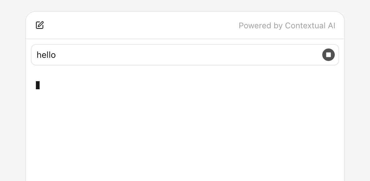
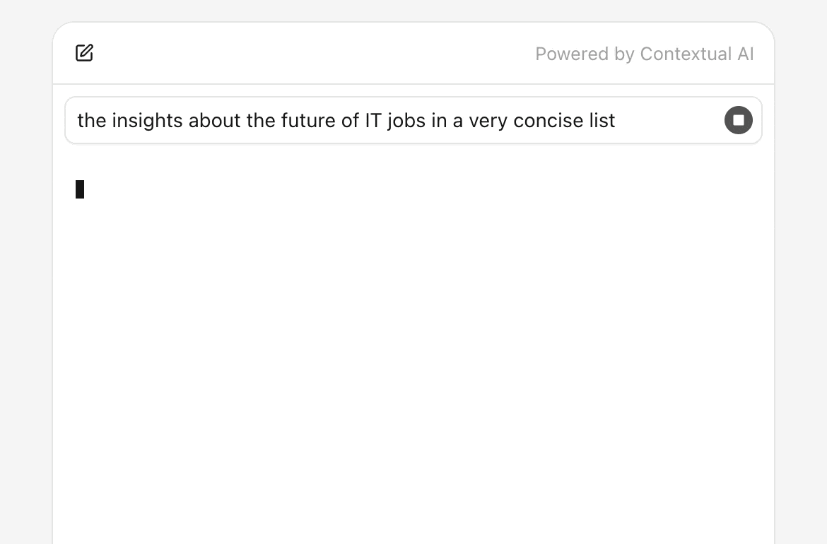
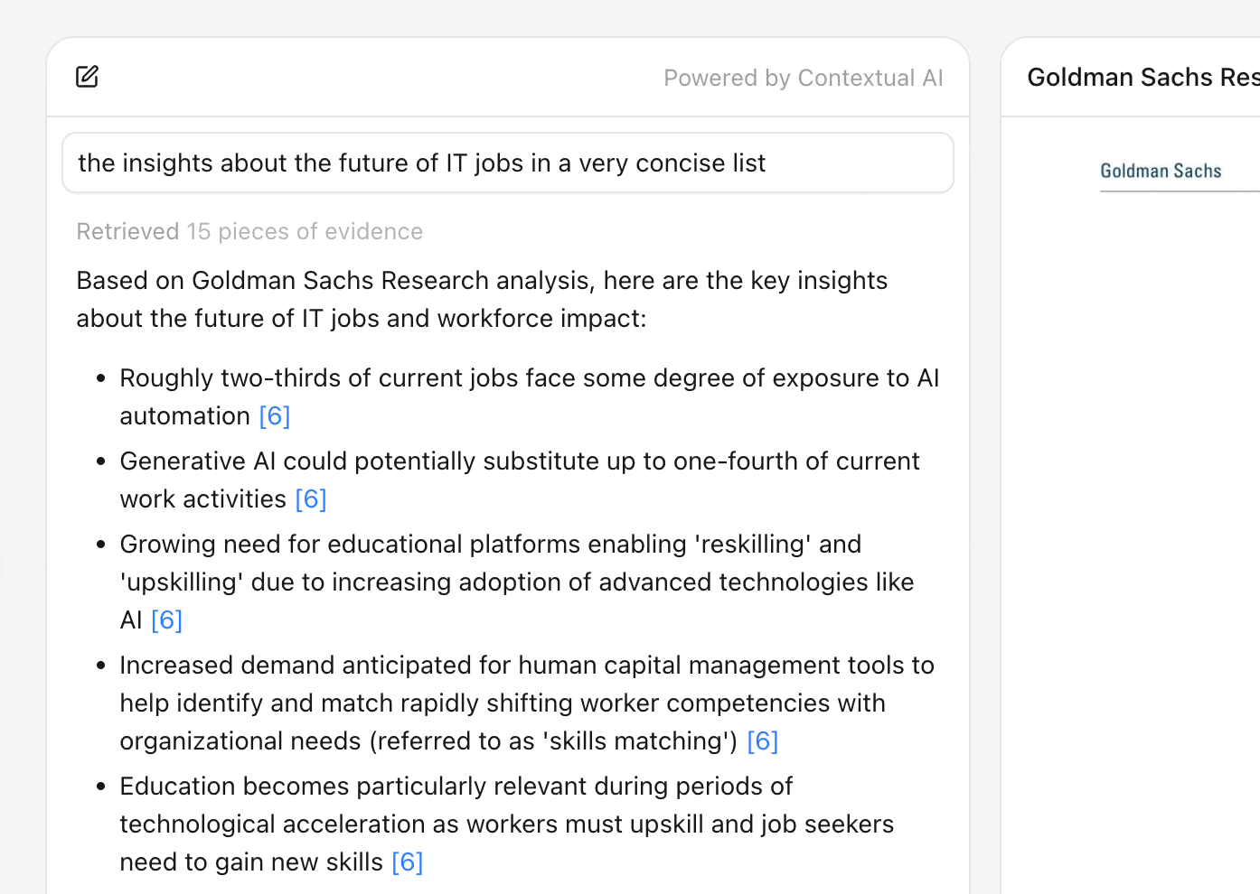
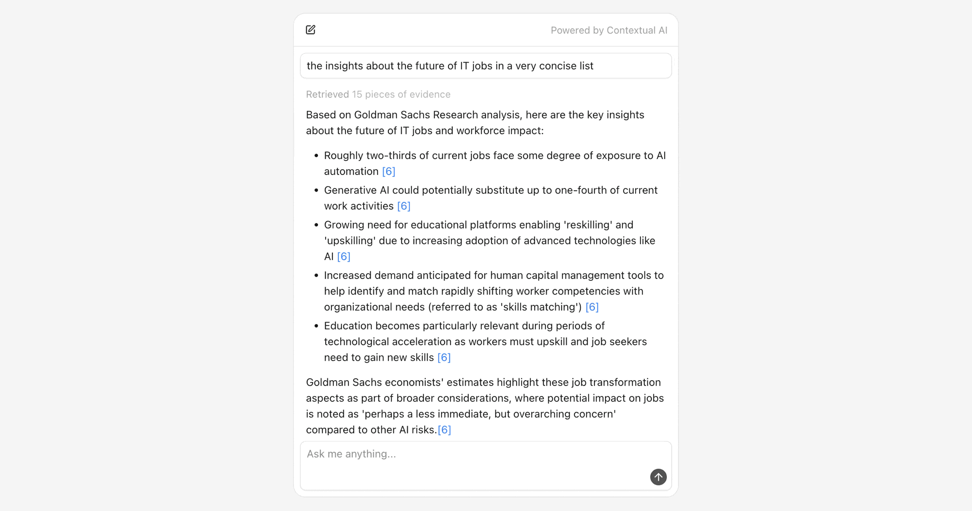
User message
User message is the prompt that the user has entered and been sent to the agent. It should be a simple message bubble with an inline stop button for terminating the streaming when necessary.
tsx
"use client";

import { Oryx, useOryxContext, useOryxStatus } from "@contextualai/oryx-react";
import { SquareIcon } from "lucide-react";

function UserMessage() {
  const { stop } = useOryxContext();
  const { isStreaming } = useOryxStatus();

  return (
    <div className={"flex items-end rounded-lg border bg-white shadow-xs"}>
      <p className={"min-w-0 flex-1 text-sm text-neutral-900 px-2 py-1.5"}>
        <Oryx.Message.User />
      </p>
      {isStreaming ? (
        <div className={"shrink-0 p-1.5 flex"}>
          <button
            type={"button"}
            onClick={() => stop()}
            className={
              "size-5 rounded-full flex items-center justify-center bg-neutral-600 hover:bg-neutral-800"
            }
          >
            <SquareIcon
              size={10}
              fill={"currentColor"}
              className={"text-neutral-50"}
            />
          </button>
        </div>
      ) : null}
    </div>
  );
}
Agent message
Agent message is the response from the agent. It should be a styled message container (without border or card) with markdown rendering.
If you are looking for UI solutions that don't render broken markdown during streaming, when syntax hasn't been fully completed, try
streamdown.
tsx
"use client";

import { Oryx } from "@contextualai/oryx-react";

function AgentMessage() {
  return (
    <Oryx.Message.Agent
      render={(content) => (
        <div className={"text-sm leading-normal text-neutral-900"}>
          <Markdown>{content}</Markdown>
        </div>
      )}
    />
  );
}
Message toolbar
In our examples, message toolbar serves as a place to display streaming indicator, error message, and a copy button for copying the raw markdown content (agent message).
tsx
"use client";

import { useOryxMessage, useOryxStatus } from "@contextualai/oryx-react";
import { CopyIcon } from "lucide-react";

function AgentMessageToolbar() {
  const { state } = useOryxMessage();
  const { isStreaming, error } = useOryxStatus();

  const handleCopy = async () => {
    await navigator.clipboard.writeText(state.agentMessage?.content ?? "");
  };

  return (
    <div className={"flex items-center gap-3 mt-2"}>
      <div className={"min-w-0 flex-1 min-h-6 flex items-center"}>
        {isStreaming ? (
          <span
            className={"inline-block w-1.5 h-3 bg-neutral-900 animate-pulse"}
          />
        ) : null}
        {error ? (
          <span className={"text-xs text-red-600"}>Error: {error.message}</span>
        ) : null}
      </div>
      {!isStreaming ? (
        <button
          type={"button"}
          onClick={handleCopy}
          className={"p-1.5 rounded hover:bg-neutral-100"}
        >
          <CopyIcon size={14} className={"text-neutral-900"} />
        </button>
      ) : null}
    </div>
  );
}
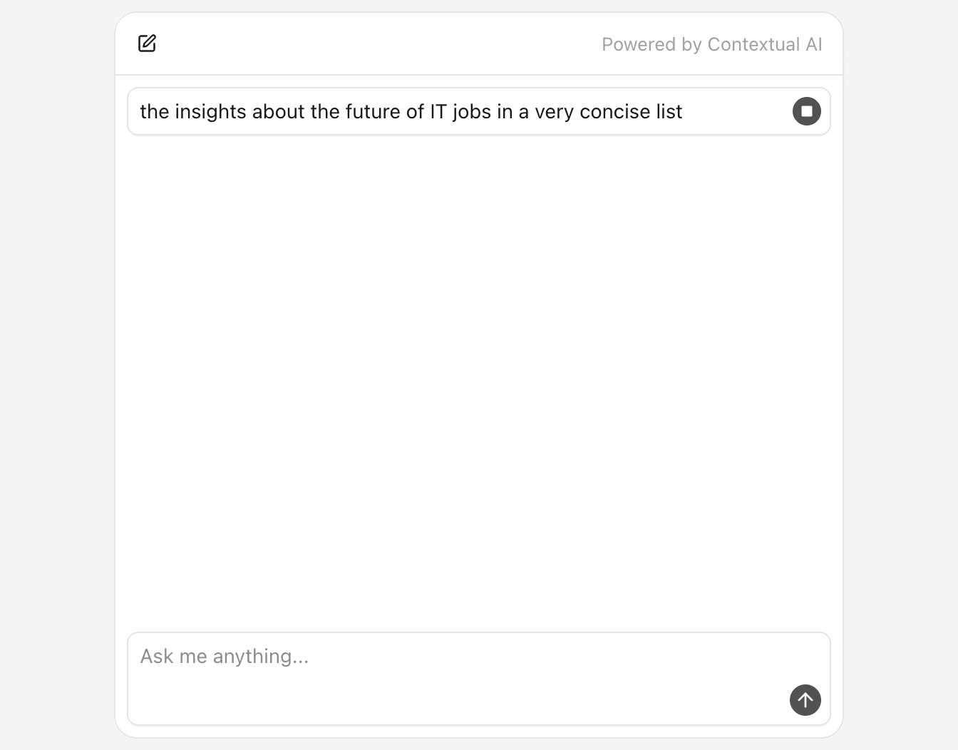
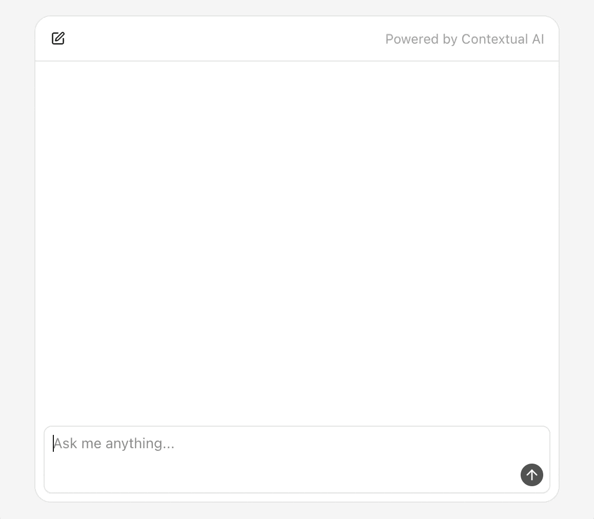
Input bar
Input bar is the form with textarea and submit button. Enter key submits, Shift+Enter adds a newline.
tsx
"use client";

import { ArrowUpIcon } from "lucide-react";

type InputBarProps = {
  value: string;
  onChange: (value: string) => void;
  onSubmit: () => void;
};

function InputBar({ value, onChange, onSubmit }: InputBarProps) {
  const handleKeyDown = (event: React.KeyboardEvent<HTMLTextAreaElement>) => {
    if (event.key === "Enter" && !event.shiftKey) {
      event.preventDefault();
      onSubmit();
    }
  };

  return (
    <form
      onSubmit={(e) => {
        e.preventDefault();
        onSubmit();
      }}
      className={"flex flex-col gap-1 rounded-lg border bg-white shadow-xs"}
    >
      <textarea
        value={value}
        onChange={(e) => onChange(e.target.value)}
        placeholder={"Ask me anything..."}
        className={
          "px-2 py-1.5 text-sm text-neutral-900 focus:outline-none resize-none"
        }
        onKeyDown={handleKeyDown}
      />
      <div className={"flex items-center justify-end px-1.5 pb-1.5"}>
        <button
          type={"submit"}
          className={
            "size-6 rounded-full flex items-center justify-center bg-neutral-600 hover:bg-neutral-800"
          }
        >
          <ArrowUpIcon size={16} className={"text-neutral-50"} />
        </button>
      </div>
    </form>
  );
}
Retrieval list
Retrieval list is a collapsible section with styled retrieval item buttons.
tsx
"use client";

import { Oryx, useOryxRetrievalItem } from "@contextualai/oryx-react";

function RetrievalItemButton(props: { onSelect: (contentId: string) => void }) {
  const { retrieval } = useOryxRetrievalItem();

  return (
    <button
      type={"button"}
      className={"text-xs truncate text-neutral-400 hover:text-neutral-500"}
      onClick={() => props.onSelect(retrieval.contentId)}
    >
      <Oryx.Retrieval.DocumentName />
    </button>
  );
}

function RetrievalsSection(props: { onSelect: (contentId: string) => void }) {
  return (
    <Oryx.Retrievals.Section>
      <Oryx.Retrievals.SectionTrigger
        className={
          "text-xs text-neutral-400 hover:text-neutral-600 cursor-pointer"
        }
      >
        <Oryx.Retrievals.DocumentsCount
          render={(count) => (
            <>
              Retrieved {count} {count === 1 ? "piece" : "pieces"} of evidence
            </>
          )}
        />
      </Oryx.Retrievals.SectionTrigger>
      <Oryx.Retrievals.SectionContent
        className={"flex flex-wrap gap-1.5 pl-3.5 py-2"}
      >
        <Oryx.Retrievals.List>
          <RetrievalItemButton onSelect={props.onSelect} />
        </Oryx.Retrievals.List>
      </Oryx.Retrievals.SectionContent>
    </Oryx.Retrievals.Section>
  );
}
Retrieval preview panel
Retrieval preview panel is a panel with header, close button, and styled loading, error, or content states.
tsx
"use client";

import {
  Oryx,
  type OryxRetrievalPreviewFetcher,
} from "@contextualai/oryx-react";
import { XIcon } from "lucide-react";

const fetcher: OryxRetrievalPreviewFetcher = async ({
  contentId,
  messageId,
}) => {
  const res = await fetch(
    `/api/retrieval?contentId=${contentId}&messageId=${messageId}`,
  );
  const data = await res.json();
  return data.content_metadatas?.[0] ?? null;
};

function RetrievalPreview(props: {
  contentId: string;
  messageId: string;
  onClose: () => void;
}) {
  return (
    <Oryx.RetrievalPreview.Root
      contentId={props.contentId}
      messageId={props.messageId}
      fetcher={fetcher}
    >
      <div
        className={
          "h-11 flex items-center justify-between px-3.5 border-b bg-neutral-50"
        }
      >
        <h2 className={"text-sm font-medium text-neutral-900 truncate"}>
          <Oryx.RetrievalPreview.DocumentName />
        </h2>
        <button
          type={"button"}
          onClick={props.onClose}
          className={"p-1.5 rounded hover:bg-neutral-100"}
        >
          <XIcon size={14} className={"text-neutral-900"} />
        </button>
      </div>

      <div className={"flex-1 overflow-y-auto"}>
        <Oryx.RetrievalPreview.Loading>
          <div
            className={
              "flex items-center justify-center p-8 text-sm text-neutral-600"
            }
          >
            Loading preview...
          </div>
        </Oryx.RetrievalPreview.Loading>

        <Oryx.RetrievalPreview.Error>
          <div
            className={
              "rounded-lg border border-red-200 bg-red-50 p-4 text-sm text-red-900"
            }
          >
            <Oryx.RetrievalPreview.ErrorMessage />
          </div>
        </Oryx.RetrievalPreview.Error>

        <Oryx.RetrievalPreview.Content>
          <Oryx.RetrievalPreview.Image />
        </Oryx.RetrievalPreview.Content>
      </div>
    </Oryx.RetrievalPreview.Root>
  );
}
Putting it together
Want to try it yourself? Explore our basic usage example — all snippets above come straight from it, so you can dive in right away.
© 2025 Contextual AI, Inc.
Proudly open sourced under the Apache 2.0 license.